
Why it matters
Education is a human right. That means all humans — young, old, rich, poor, able-bodied or impaired — have the right to access quality teaching and learning materials. The reality is far from this ideal, but with the arrival of digital technologies and the World Wide Web, education has been able to reach far more of us than ever before.
Except when it’s not accessible.
Accessibility is about designing to overcome any barriers that might prevent people from accessing or benefiting from something as a result of disability, impairment or disadvantage. The barriers might be physical, social, cognitive, psychological, or socio-economic — so it’s complex work, but it’s essential work. It’s also, in Australia, the law.
Learners experience all kinds of access barriers. Explore these web user personas from W3C for examples of different users’ disabilities and diverse needs.

Some fundamentals of accessibility in digital learning content
Saying “fully accessible” is like saying “perfectly safe”. There’s always something we can’t predict or haven’t thought of. But these initial steps will help you ensure your fundamental access bases are covered. And they will help so many learners. So many more than you think.
Colour contrast
Heading levels
Meaningful link text
Reading order
Image alt text
Captions and transcripts
Colour contrast
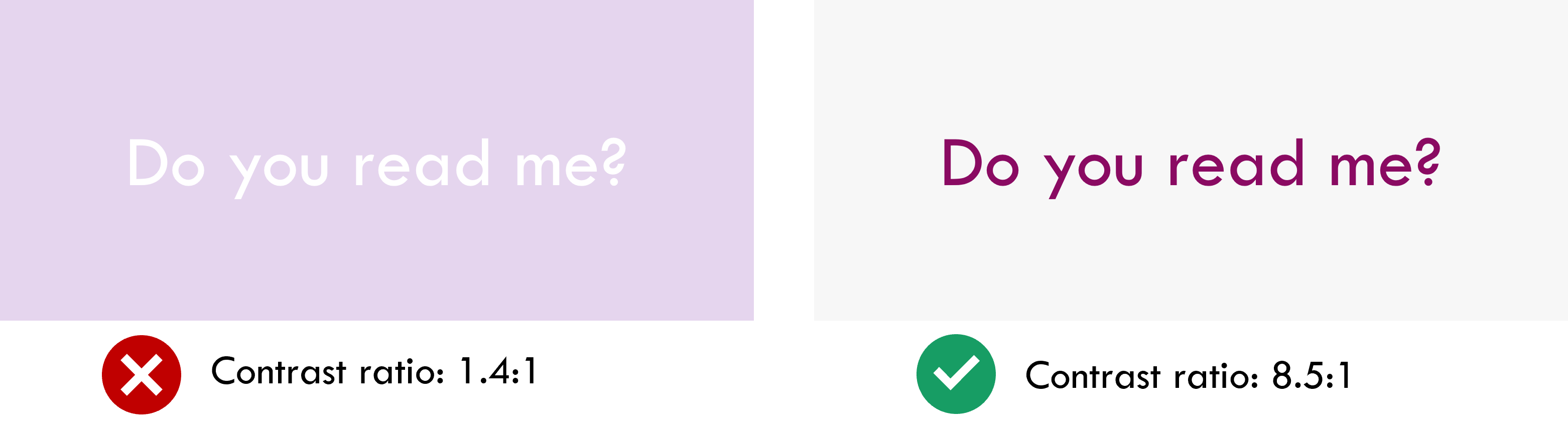
Check the contrast between your text and background, and make sure it’s at least 4.5:1. I always recommend using the WebAIM Contrast Checker for this. Just find the HEX codes for your text and background (the six-character values for each colour — for instance, #000000 is black) and pop them into the checker.
This helps: people with low or no vision (literally billions of them), colourblind people, people using poor screen displays, people viewing in low light
Heading levels
Make sure you’re using HTML heading levels in the correct sequence (Heading 1, Heading 2, etc.) not because of how they look, but because they indicate the intended hierarchy of the content.
This article from The A11y Project provides a neat, powerful summary of web heading good practice.
This helps: people accessing with a screen reader, people with cognitive impairments, search engines indexing your content
Meaningful link text
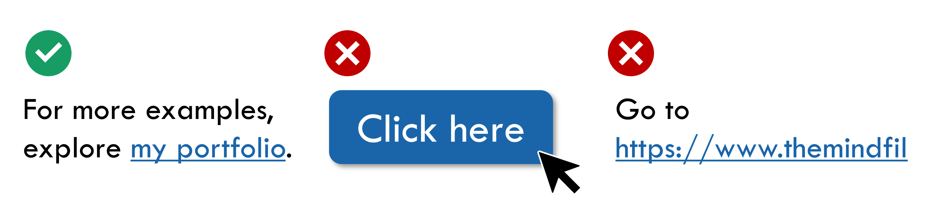
Whenever you create a hyperlink, a button, or any kind of link that takes your learner somewhere they weren’t before, give the link/button meaningful text that tells the learner where it will take them. “Click here” is a no-no! Here’s a simple guide to link text from W3C.
This helps: people accessing with a screen reader, people with cognitive impairments, search engines indexing your content
Reading order
If you’re producing a visual layout that isn’t perfectly linear, check and correct the reading order before you publish. That means making sure, if someone tabbed through the layout with their tab key, that they’d step through the elements in the order you intended them to.
This helps: people accessing with a screen reader, people using keyboard-only controls
Image alt text

Images should always have alt text, unless they are purely decorative and add no meaning at all to your design. Alt text is a short, clear description of what the image shows and what it means. It’s best to avoid images of text as much as possible, but if the image has text in it, the alt text should state exactly what it says.
Vision Australia provides these five elegant tips for getting alt text right.
This helps: people viewing with low data who cannot load images, people accessing with a screen reader, search engines indexing your content
Captions and transcripts
Any media that contains voice audio should be accompanied by captions and/or a transcript. Videos should always have closed captions. Ideally, also provide a text transcript that can be read instead of watching. For sound files, provide a text transcript too.
Captioning is easier than ever now — most video hosting platforms produce automated captions that you can proofread and correct before you publish.
This helps: people with hearing impairments, people viewing with low data who cannot load video/audio, people who are short on time, people with attention difficulties, non-native speakers
Some key frameworks
Get familiar with these concepts. They’re important for all learning designers to know and apply.

Leave a comment